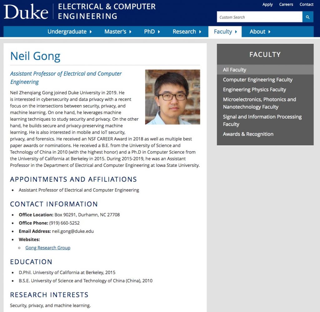
One of the toughest challenges with the New Faculty Profiles portrait series is finding a way to visually represent the faculty member’s research into the portrait. This was just the challenge I faced when photographing Professor Neil Gong, an Assistant Professor of Electrical and Computer Engineering, who is an expert in cybersecurity and data privacy technologies.
A screenshot of Professor Gong’s website. I always try to find out as much as possible about a faculty member’s area of study so that I can suggest portrait locations and backgrounds that relate to their work.
In the past, I’ve solved this problem by finding a visually interesting image from the faculty member’s research papers to use a backdrop for their portrait. However, Professor Gong didn’t have an image that would work. So, I decided to look through his website and research papers to see if I could find or create a background image from charts and diagrams included in his papers.
I am by no means a coding expert, but I know that some computer languages resemble patterns that I find visually interesting. So, when I saw a link to source code documents that he used for one of his research projects, I downloaded it, hoping to find something that could work as a backdrop image.
Screenshot of the original text file.
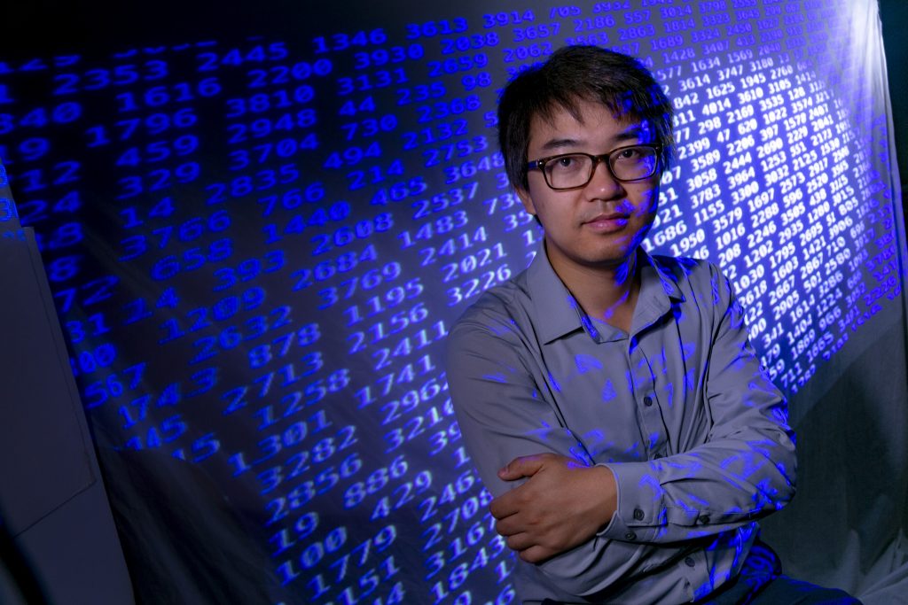
I inverted the image of the text file because I wanted the numbers to be clearly read when I projected the image.
Next, I applied a blue spotlight effect to the text in order to add drama and visual interest.
For the portrait session, I added a warp filter and cropped the image. These adjustments produced a cleared background image.
I ended up finding a text document with columns of four-digit numbers. I have NO idea what the numbers represent or how they are used, but they formed an interesting pattern. After adding a few adjustments to the original document, I had a dynamic background image that referenced Professor Gong’s field of study.
A test shot with the final version of the text image projected onto a background and subject. (Ignore the UNC symbol on the subject’s shirt. Good test subjects are hard to find and sometimes you have to work with what is available. )
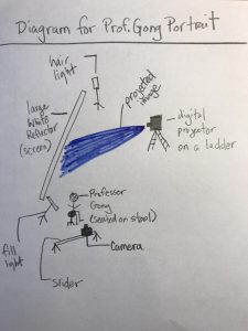
A hand-drawn lighting diagram for Professor Gong’s portrait.
After got the background image working, I to add a fill light and a hair light. I opted to use video lights so that I could easily switch between stills and video.
I ended up using a slider to create the video clip because I really wanted the numbers to have the appearance of moving. After an hour of practice pulls with the slider, I was ready for Professor Gong’s portrait session.
For the portrait session, I used an LED video light as a fill light on Professor Gong’s face and a second LED light as a hair light to provide separation between Professor Gong and the background image.
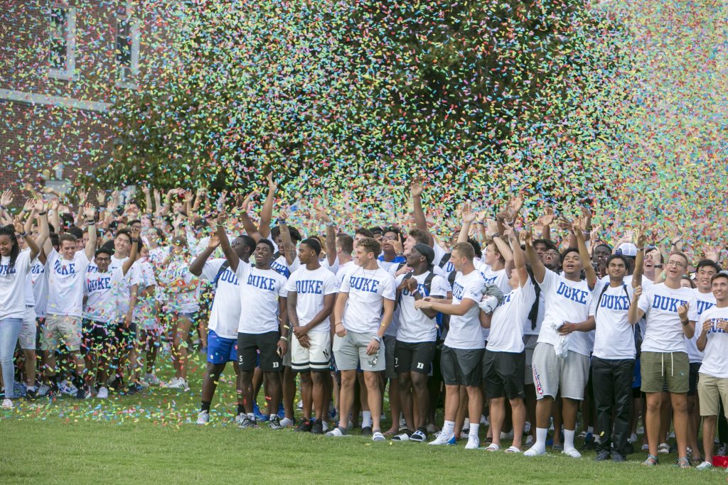
Every August, the entire first-year class gathers on the East Campus Quad for the annual group photo. This activity is one of only two experiences that the entire class participates in together as a group — the other is commencement.
First-year class photos through the years.
We wanted to build on this event by transforming it into an experience. One of the ways that we accomplished this is by using a drone to record video footage of the class of 2023. The second is with the addition of confetti!
Using the Drone:
Bill practices operating the drone over the East Campus Quad.
My colleague Bill Snead, who aced his commercial drone license exam, piloted the mission. Prior to the big day, he logged over 16 hours of practice time on East Campus. He used a DJI Mavic quadcopter, which we checked out from the Innovation Co-Lab for the event and practice sessions.
Prior to each drone flight, Bill runs through a pre-flight checklist.
Each practice session was approved by Duke and we also notified Duke Life Flight and Duke Police before each session. Before each flight, he went through a detailed pre-flight checklist, which included the purchase of insurance.
Adding Confetti:
Our number one goal was to use the class photo event to give the incoming students a fun and welcoming experience at Duke. We wanted the photo to have the feel and excitement of a pep rally. We toyed around with several ideas, but we ultimately arrived on confetti because its colorful motion looks great on video! We worked with Ultra Mix Events, who provided the confetti blowers and tech crew.
First-year students spell out “2023” during the annual Class Photo on the East Campus Quad.
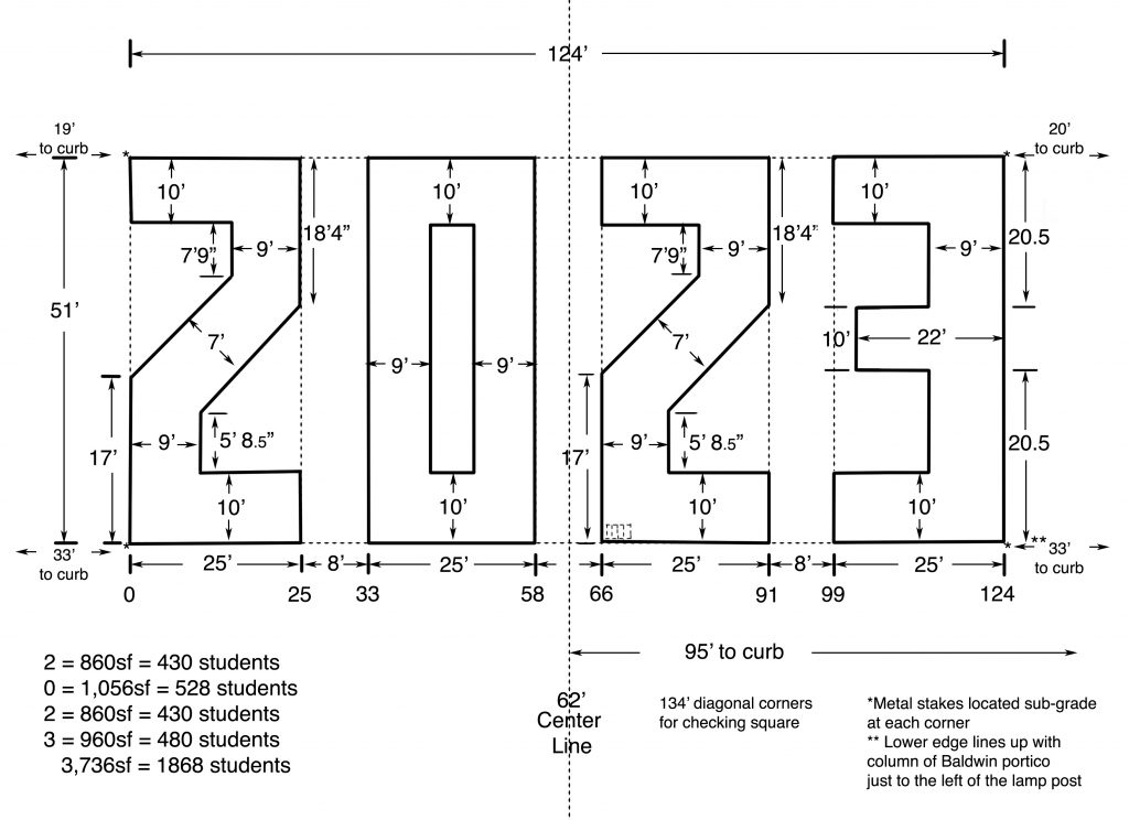
By The Numbers:
The key to getting the students to spell out their graduation year is to outline the numbers onto the quad.
The diagram for creating the Class of 2023 photo. It has become a Duke tradition for every incoming first-year class to take a group photo.
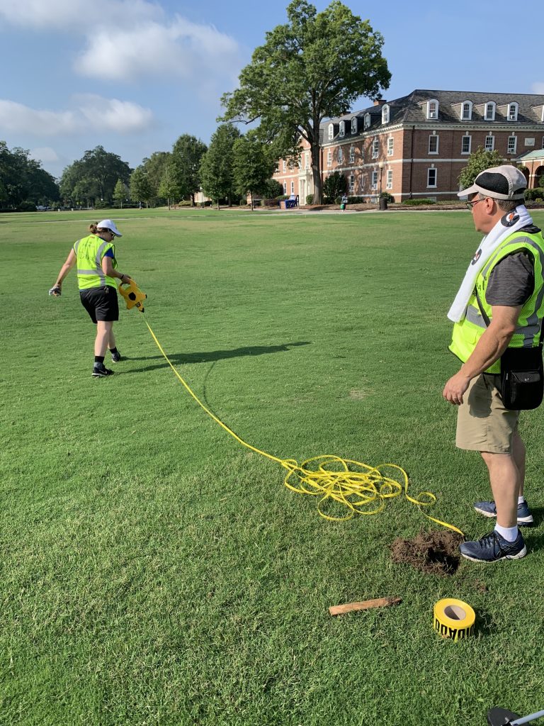
Megan Mendenhall, left, and Bill Snead, right, use a measuring tape to mark the outline of the class photo. This year, the temperatures were in the high 90s, so our team took frequent breaks and drank plenty of water.
We’ve been doing this project so long that we have measurements for 0 – 9. So, creating the diagram for each class simply involves combining the appropriate numbers into a diagram. The tough part is actually painting the outline of the numbers onto the quad, especially in the heat and humidity of late August.
Jared Lazarus, left, Caroline Pate, center, and Sam Huntley, right, stand in the outline of the number 3, as other team members (not pictured) view the numbers from above.
We start by roping off a giant rectangle on the quad. Next, we section the rectangle into four equal rectangles. Each of these smaller rectangles is turned into individual numbers by adding the appropriate angles and lines.
The Big Moment:
We wanted the drone to be in a position to capture the students as the confetti rained down. To accomplish this shot, we needed to communicate with Bill, the drone pilot, and members of the confetti crew, who were spread out in four different locations on the quad.
Left to right, Blyth Morrell, Coach Cutcliffe, Rebecca Fiorentino, Megan Mendenhall, and Matt Carden, signal to the ground crew to start the confetti blowers.
In order to keep everyone on the same page, we used the PA system to play music to cue the confetti team and Bill Snead, the drone pilot. As you can see in the video, the music not only worked as a great system for communicating with the different crews, but it also added to the upbeat feel of the experience.
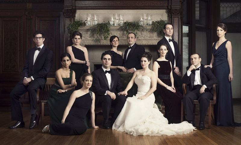
At the beginning of last Fall, our office received a request
from Hallie Knuffman in the Provost’s Office to take a group photo of the
Dean’s Cabinet – all 10 deans, the Provost and President – and I was asked to
spearhead this project.
I was excited by this opportunity because I don’t think this
has ever done at Duke – I have never seen a historical photo like this and
university archivist Valerie Gillispie hadn’t either.
What I didn’t realize at the time was how challenging it
would be to find a Dean’s Cabinet meeting when all the Deans were actually
present. In mid-Sept. one of the Deans couldn’t make the meeting and then in
the beginning of October two deans were out, and we kept pushing back the shoot
date every two weeks until their next meeting. This went on and on until
February when it was decided it wasn’t going to happen in the Spring and to set
our sights on the first meeting of the academic year when all of the Deans
should be in attendance, August 26.
I’ve done hundreds of School of Medicine departmental and divisional group photos, as well as group photos with every professional school on campus. Usually these are taken on steps and done in a formal fashion, with the participants lined up like soldiers, and several frames later (perhaps two minutes), everyone is on their way.
I didn’t want to approach the Dean’s Cabinet this way. I
wanted to make it special and different, relaxed and contemporary.
I’ve been a big fan of Annie Leibovitz’s work for more than 25 years and I admire her group photos in Vanity Fair. They seem so timeless and effortless, though there’s no doubt the opposite is true and photo assistants, publicity handlers, and furniture/props people are involved in some way before or during the creation of this image.
But as critical as the end result was the experience – we wanted the shoot to be smooth and efficient, so the Deans’ Cabinet could get on with the important business of the day. Hallie had told me we could have 15 minutes and possibly up to 30 minutes for the photo session. I felt confident we could do the photo in 20 minutes but felt like we could do it in 15 if we had to. I had photographed a group of Heart Center leadership several years before with a similar approach in mind and the photo took 15-20 minutes – most of this time was spent on posing the doctors to look more relaxed. My director, Blyth Morrell, asked me to take no more than 15 minutes of their time, and I felt like we could compromise a little bit on the styling and still create a natural looking arrangement with relaxed poses in this amount of time.
I had scouted multiple locations near the Allen Board Room that we could potentially use for the photo to look at space, light, etc. and had come up with the Gothic Reading Room and Brodhead Center. But neither of those spaces were going to work on the first day of classes, so Blyth suggested we do the shoot in the Karsh Alumni Center’s Moyle Board Room. I was nervous in July and August as Claudia Attarian with Alumni Affairs kept me updated on the furniture delays from England, but a week before the shoot, the tables, chairs and couches arrived and we were finally able to look at all the elements together – space, furniture, and sunlight – as well as figure out where the President, Provost, and each Dean would be positioned in the photo.
Then, five days before the shoot, Claudia (on behalf of
director of operations Scott Greenwood) asked us to move the shoot to the
atrium so the Deans could have their meeting in the Moyle Board Room – the
setup and breakdown of the lighting equipment would be disruptive to the
meeting so we needed a different space for the photo.
We hadn’t really considered this space before and I
immediately liked the brighter, airy space, though the rays of sunlight at 10am
looked like they could become problematic and create uneven light across the
group. The forecast was showing rain all weekend and 98% cloud cover for Monday
so I liked my chances.
On Saturday morning, Claudia graciously opened up the Karsh
Center for my colleague Megan and I – she photographed the Price family earlier
that morning in the Moyle Board Room. We then set up four large softboxes and
experimented with different furniture arrangements – two chairs and a loveseat,
two loveseats, until we settled on five chairs near the center of the room.
The night before the shoot, I rehearsed running through a
quick 30 second intro to what we were trying to accomplish – a natural looking
group picture in which everyone looked relaxed in their individualized pose. I showed
a Vanity Fair photo as a reference, though I knew this would bring laughter
because one of the participants was lying across the floor. I assured them I
wouldn’t ask anyone to do this.
On Monday at 7:30am, I fine tuned the lighting, tethered my
camera to my laptop for immediate feedback, and reset the furniture that the
cleaners had put back.
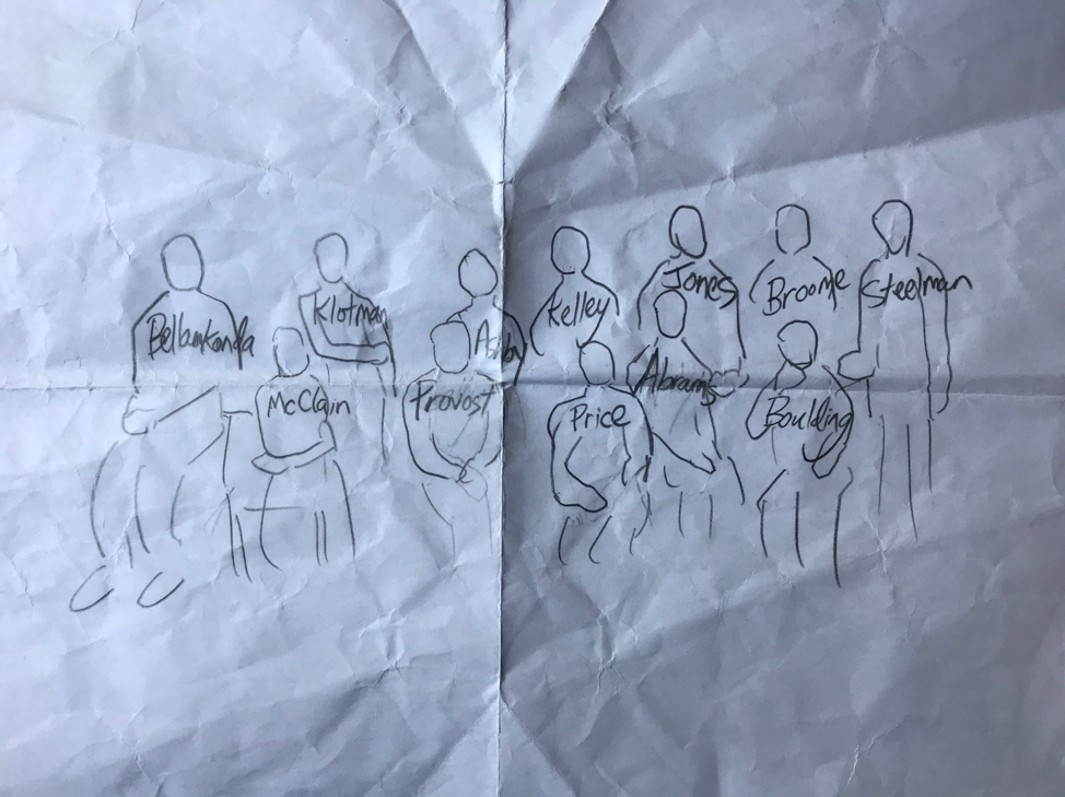
At 9am, we began doing test shots. I had sketched out where each Dean would sit or stand and we had several stand ins: Blyth, my colleagues Sam Huntley (web developer/information designer) and Caroline Pate (web developer/information designer), Claudia and her colleagues Courtney Hill and Emily Deahl, Hallie and her teammate Mary Greenway. I tweaked the lighting for several minutes – it was looking too flat and I wanted more ratio between light and shadow on the faces – until it was to my liking. The skies outside were still overcast but my anxiety rose as clouds were starting to reveal some sunlight. Blyth suggested we swap in three stools instead for two of the chairs to create some height differences, which I favored to make the group appear less rigid and formal.
Shortly after, my colleagues Megan, Julie Schoonmaker (video
manager), and Bill Snead (digital assets manger and Photoshop master) arrived
from capturing exterior drone footage of the Karsh Alumni Center, to be used in
a video announcing its opening.
Most of the Deans had arrived several minutes before 10am and Hallie asked if I wanted to begin arranging people. I’ve made this mistake before – as soon as people are sitting down for the photo they become more anxious and impatient as the shoot progresses. I said they should keep talking and catching up for a couple more minutes. By 10am we started – turning Dean Ravi from right to left, angling Dean Steelman to the camera, moving Dean Broome several inches to her left, shooting several frames as we kept making adjustments. The clouds had parted by now and a ray of sunlight was creating an unwanted halo effect on Dean Klotman’s hair. I stopped shooting and looked at the lighting on my laptop with Bill, and he assured me he could swap her hair from another frame in which the exposure was good.
I kept shooting, all the while Blyth, Hallie, Sam, Bill and myself helping to fine tune the grouping and poses. About ¾ into the shoot things visibly gelled – expressions, poses, body language, all coming together – and 48 frames later it was a wrap. The Deans, President Price and Provost Kornbluth crowded around my laptop to look at the photo and everyone seemed happy with the end result as Julie captured several behind the scenes moments with her phone.
Blyth looked at her watch and was smiling as she declared I
did it in 15 minutes. I felt good, relieved that we had finally pulled off this
picture I had envisioned and planned for months.
One of the biggest challenges I face as a higher ed video creator is
how to bring historical research to life. Because this sort of research
involves things that have happened in the past, it can be challenging to find a
captivating visual way to explain the findings. Recently, I was recently asked
to showcase the research of Elizabeth Schrader, a graduate student from Duke
Divinity School. She discovered Mary Magdalene’s name had been altered by
scribes in numerous copies of the Bible to downplay her prominence. I asked Elizabeth
to meet me at Duke’s
Rubenstein Library archives where she’d found an example of the change
to Mary’s name in a 12th-century manuscript.
I
planned to capture a few slider shots of her looking at the manuscript. I
thought the visual would make a nice compliment to my colleague’s article on
her research.
When I met with Elizabeth, we struck up a casual conversation and she
described in detail the exact thing she’d discovered. On two adjacent bible
pages, she showed me Mary’s name, Martha’s name and a third name where Mary’s
name was altered to Martha’s name. Seeing all three ancient Greek words while
simultaneously hearing Elizabeth’s explanation brought her discovery to life before
my eyes. I wanted to help the public understand her work. A simple slider shot
would not do her research justice.
I scrapped my initial visual plan. Instead, I asked my colleague to photograph the two bible pages where the three examples occurred.
I recorded audio of Elizabeth explaining her findings. Then I
found each name in the digital version of the same manuscript pages and cropped
them out.
Using Premiere Pro, I matched the three names to the actual spot in the Bible photograph where they appear. I laid the voice track of Elizabeth’s explanation below the visual.
I used Premiere Pro’s spotlight effect to highlight each name as Elizabeth described them in detail.
The final visual showcased Elizabeth’s research in a way that made
her discovery easy to comprehend.
The experience reminded me to take the time to talk to researchers I work with and really understand their work, which will result in finding the best possible way to showcase it.
I was also flexible and open to shifting gears on the fly, which
can be tough to do but was the right move in telling this story effectively.
Shortly after Duke’s Communications Office shared her story,
Elizabeth sent me an email:
“Julie your videos
are AMAZING!!! I am so impressed with the work you’ve done! Those videos are
simply spectacular. They are so easy to understand, and pretty too. It
makes the article stand out so much! … This is incredible work – thank you thank
you for this amazing contribution to helping make people aware of my
research! I hope our paths cross again soon so I can thank you in person :)”
Welcome to The Digital and Strategic Communications team blog. We’ve often been asked, “How did you do that?”. We are blessed with a talented team of people. They are curious and inspired. No job comes without its hardships but we are lucky to be charged with telling Duke’s story in the most creative ways possible.